Dark vs. Light
The A21 Campaign and
UnRecorded are two very similar yet very different websites. The A21 Campaign
is an organization devoted to stopping the issue of human trafficking. Human
trafficking is an issue that not many people know about and although it mainly
takes places in the UK it is present in the US as well. I chose this website
because I like the layout of the website and how they decided to present their
information. Due to how the layout is so nicely done, the reader’s eye flows
across the page in the way the author intends one too. So you see one thing
before another, this was the authors intention. They also played their main
color scheme into their theme extremely well.
UnRecorded is a music blog based around indie and pop music. It allows for user to read their reviews of music as well as new going on with bands and artists. This website is geared more towards those “no name” bands and artists. I chose this website because of the modern feel the authors play into it. They do this using their orange and white color scheme and their logo (located below). This website is also very organized with its layout. They have a section for news, reviews and more. Each section has its own subsection’s with more on each category, just divided down further. They use pictures accordingly to the bands or artists they are talking about. Your eye flows across the page with its layout.
UnRecorded is a music blog based around indie and pop music. It allows for user to read their reviews of music as well as new going on with bands and artists. This website is geared more towards those “no name” bands and artists. I chose this website because of the modern feel the authors play into it. They do this using their orange and white color scheme and their logo (located below). This website is also very organized with its layout. They have a section for news, reviews and more. Each section has its own subsection’s with more on each category, just divided down further. They use pictures accordingly to the bands or artists they are talking about. Your eye flows across the page with its layout.
The A21 campaign
The A21 Campaign is an organization that is working to end human trafficking. They work to education those who are unaware about this issue. They do this in any way possible, for example: they have 'street teams' and they go and speak at universities, churches, etc.
The website states that the campaign is open to anyone that wants to take part and help make a change. From those who just would like to make a donation, to request someone to come and speak at an institution, becoming a volunteer, interning with the campaign at one of their locations around the world (as long as you live close), and joining their team and actually working with them. The website is very user friendly. It constantly uses the same basic color scheme of black, white, red, and grey throughout the site, it kind of creates a dreary mood. In addition to just using pictures to get their point across they use interesting visuals and facts to attract the reader (who really wants to sit there and read a boring old paragraph? Pictures break it up!). The campaign's logo (located above) is just simply The A21 Campaign in an interesting design. They advertise the stories of those who have been rescued and use that to draw a lot of people in. They also strategically place statistics, such as "99% of victims are not rescued," on the main page to draw readers in. Finally on the main page they state they are celebrating their 6th year anniversary. They also strategically places their mission statement at the bottom of the main page: “The A21 Campaign exists to abolish injustice in the 21st century through a comprehensive system of preventative measures, victim protection, prosecution of violators, and strategic partnerships.” They make it known right on the main page, before anyone even starts exploring their website, what their purpose is and what their goal is. Finally, on the main page they also place the progress they have made over the course of the campaigns exists. Such progress as over 9 thousand active abolitionists, 4 restoration facilities and 10 offices in 9 countries. The authors make it easy to read and very interesting as well. They make it clear they are talking to a large audience. One can easily navigate this website and you can also leave your e-mail to stay up to date with anything going on with human trafficking. The creators of the website organized it in such a way that the readers eyes just kind of flow across the page so that you do read everything that is important to know. This website has a nice layout, very easy to use. It's organized nicely and most importantly they don't make it just “another ol' website.” They take a very serious topic and make it their own but making it visually appealing to the reader. The authors of this site make the readers want to read more in how they place the information and design it. The website has a very modern feel to it, it doesn't feel outdated and boring. |
Unrecorded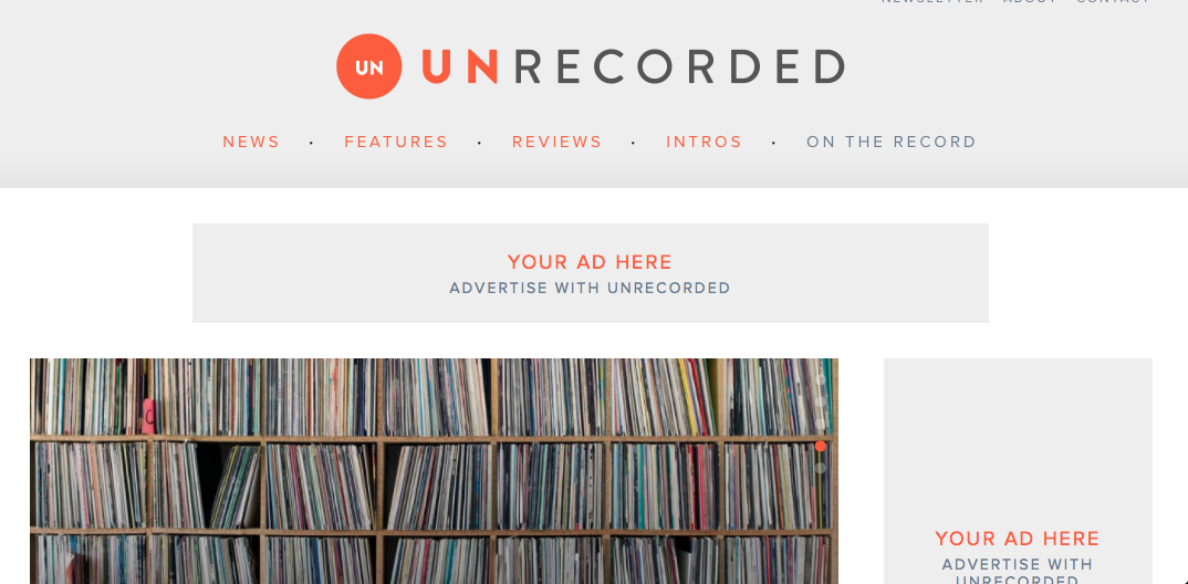
Unrecorded is a music blog based around indie and pop. The site was designed by a woman of the name Becky Rother. The blog has spaces on the website allowing people to advertise in multiple spots on their site in more prominent spots as well as on the bottom of the page where someone would most likely see it scrolling down the page after reading everything. It talks about new and upcoming artists or just those 'no name' type of bands and artists. The website uses a lot of pictures of artists, album covers, and bands. They offer review of all the music, news on bands and artists, such as if they have a new single or album release. Not only do they offer reviews of just the bands or artists music but they offer reviews of their music videos as well.
The logo for the website is 'un' in white words in an orange circle. It goes with the rest of the site in that the main scheme of the site is white and orange. It creates a very modern feel, especially with the design of the website itself. It’s very simple, bright and an airy type of feel. It’s very organized, with different sections for each type of review or news. The authors of the site sound very laid back. They don't sound as urgent as the A21 Campaign, but they certainly know they are speaking to a larger audience, not just a direct audience. Since the website has a very modern feel the language goes very well. They are casual yet sophisticated, they speak very nonchalant as in as if they were talking to just another person on the street. They use very beautifully descriptive language in their reviews and get their point across very nicely. The website allows you to listen to some bands, or artists, music by linking an mp3 onto their site through sound cloud. You can also sign up for newsletters, just like on the A21 Campaign’s website. On the bottom of the page they also leave space to apply to jobs with their blog, they have a space to contact them as well. In addition they also have links to other music blogs based on other types of genres or even based on a variety. One other thing they have on the bottom of the page is another website linked to the website’s creator’s website. Becky Rother, based on website designing for both desktop platforms and mobile platforms. I like this website because of the modern feel and how nicely laid out it is. It's very organized, with a section for news and subsections there, a section for reviews with its own subsections and more. The website also has a section new and upcoming artists, or those “no-name” bands and artists. In this way it's very similar to the A21 Campaign's website but it isn't so dark. Unrecorded is more of an upbeat, light, airy feel. |
In the end, the A21 Campaign website and UnRecorded are two similar yet very different websites. The A21 Campaign has a very dreary feel to it with its black, red and grey color scheme. UnRecorded is the opposite with an orange and white color scheme that gives off of a more bright and airy feel. They both have a very modern feel to them with their layouts and visual designs. Both websites layouts are very organized and visually appealing, the readers eye’s flow across the page. In creating my own website I will keep in mind the organization issue, to make the reader’s eye flow across the page and make it visually appealing.
